Follow this new tutorial and learn how to create a summery dragon fruit text effect in Adobe Illustrator.
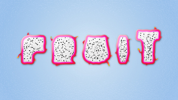
Final Image
This is the final image that we’ll be creating:
Tutorial Details
Resources
Step 1
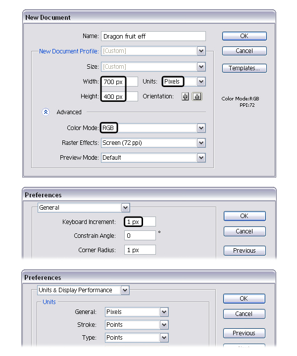
Launch Illustrator and go to File > New to open a blank document. Type a name and set up the dimensions then select Pixels as Units and RGB as Color Mode. Next, go to Edit > Preferences > General and set the Keyboard Increment to 1px and while there, go to Units & Display Performance to make sure that the Units are as indicated. I usually work with these settings and they will help you throughout the drawing process.
Step 2
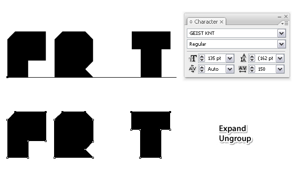
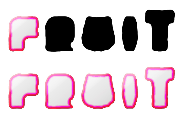
Let’s start with the letters. Grab the Type Tool (T) and type only the letters “FRT” from “FRUIT” using Geist Knt font and the settings indicated.
After you’re done, select Expand from the Object menu and Ungroup (Shift-Control-G).
Step 3
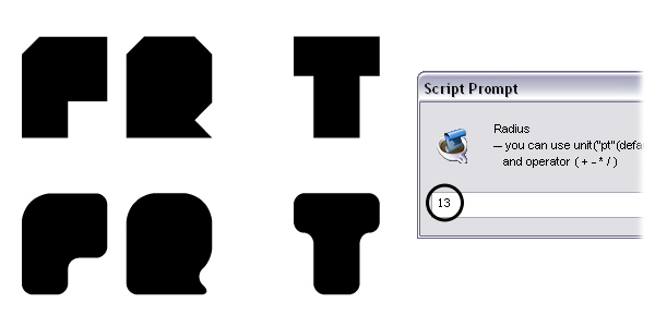
Before you continue, download the Round Any Corner script. Follow the instructions to install it then restart Illustrator. Using this script you can easily round one or more corner points of a path.
Now, select the three letters and go to File > Scripts> Round Any Corner. Run the script using a Radius of 13.
Step 4
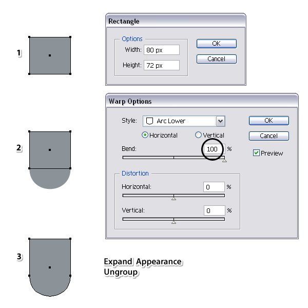
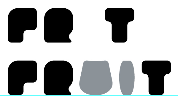
Next, you will create the letter “U” from “FRUIT”. Take the Rectangle Tool (M) and draw an 80 x 72px rectangle using the fill color of your choice (1).
While this shape stays selected, go to Effect > Warp > Arc Lower and apply a 100% Horizontal Bend (2).
Select Expand Appearance from the Object menu then Ungroup (Shift-Control-G) in order to expand the effect applied (3).
Step 5
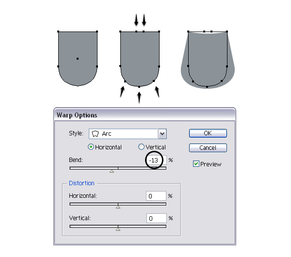
Next, grab the Add Anchor Point Tool (+) and add five extra points, two at the top and three at the bottom as indicated in the image below. After you are done, go to Effect > Warp > Arc and apply a -13% Horizontal Bend.
Step 6
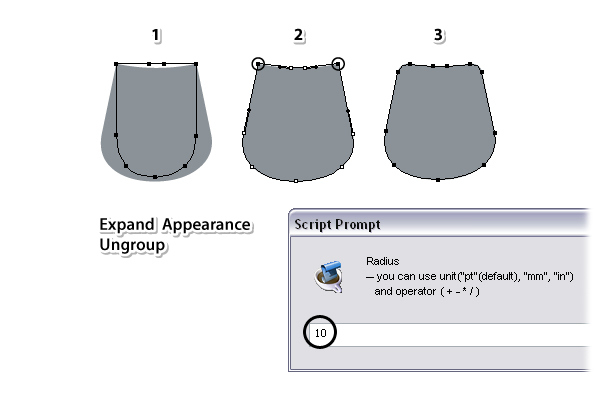
Having the letter “U” selected, choose Expand Appearance then Ungroup (Shift-Control-G) in order to expand the effect applied earlier (1).
Now, use the Direct Selection Tool (A) to select only the two points indicated (2) then go to File > Scripts > Round Any Corner and apply a Radius of 10. As a result you will get the rounded corners at the top (3).
Step 7
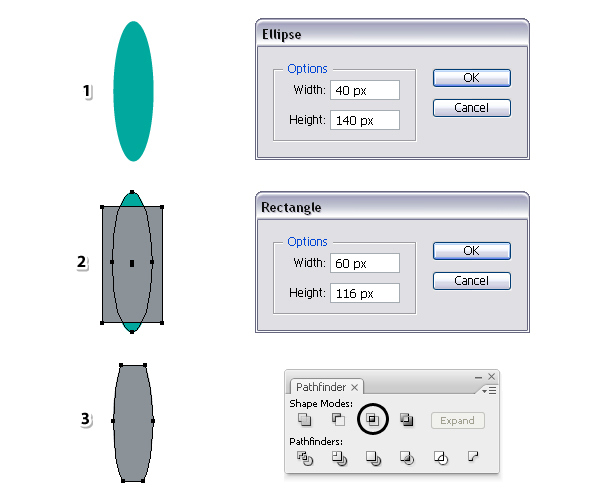
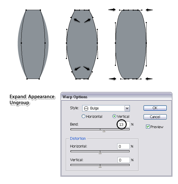
Let’s continue with the letter “I”. First, take the Ellipse Tool (L) and draw a 40 x 140px ellipse (1).
Next, take the Rectangle Tool (M) and draw a 60 x 116px rectangle then arrange it over the ellipse as in the image (2).
Select the two shapes and press Intersect in the Pathfinder panel (3).
Step 8
Having the shape that you have obtained in the previous step selected, go to Effect > Warp > Bulge and apply a 13% Vertical Bend.
After that, select Expand Appearance and Ungroup (Shift-Control-G).
Now, focus on the four corner points and using the Direct Selection Tool (A) change the position of the handles as shown below. Also make the handles of the anchor points from the middle a little longer.
Step 9
Arrange the letters “U” and “I” in between the others to compose the word “FRUIT”. At this point the letters should be about the same size. If not, you can make slight adjustments. Also make sure that you have equal space between the letters.
Step 10
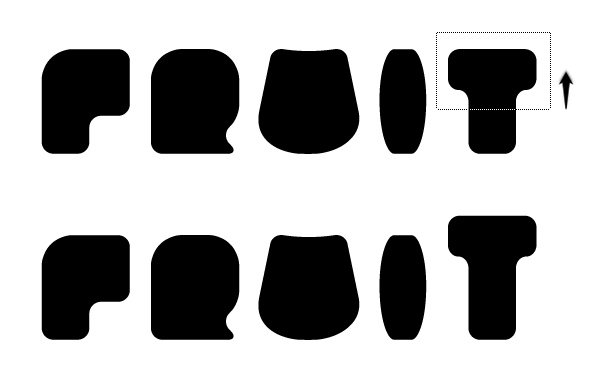
Next, take the Direct Selection Tool (A) and drag a selection over the anchor points in the upper half of the letter “T” and move them upwards in order to make it bigger than the rest.
Step 11
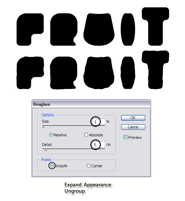
Select all the letters and go to Effect > Distort & Transform > Roughen. Apply the settings shown and hit OK. Don’t forget to select Expand Appearance and Ungroup (Shift-Control-G) at the end.
Step 12
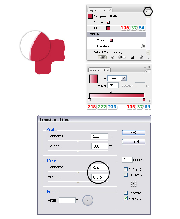
At this point we are ready to create the dragon fruit style. Focus on the first letter, in this case “F” and select dark red as the fill color.
While the letter stays selected, go to the Appearance panel and from the fly-out menu choose Add New Fill in order to add a second Fill attribute.
Select this second Fill from the bottom of the Appearance panel and replace the existing fill color with the linear gradient shown at a -50 degrees Angle.
Still having this Fill attribute selected, go to Effect > Distort & Transform > Transform and apply the settings shown below. Basically, you are moving the second fill 1px to the left and half a pixel upwards in order to get a highlight.
Step 13
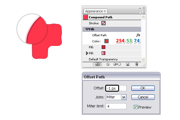
Having the letter “F” selected, from the fly-out menu of the Appearance panel choose again Add New Fill.
This third Fill attribute should be at the top of the Appearance panel above the other two. Select bright red as the fill color then go to Effect > Path > Offset Path and apply a -1px Offset.
Step 14
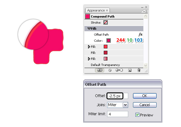
Still having the letter F selected, add a fourth Fill attribute above the others. Select the color indicated as the fill color then go to Effect > Path > Offset Path and apply a -2.5px Offset.
Step 15
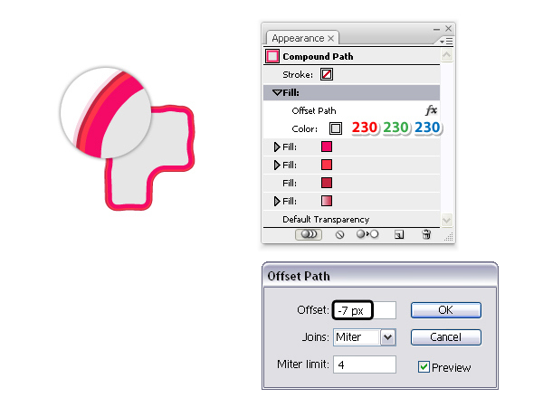
Add a fifth Fill attribute above the others and select light gray as the fill color.
Next, go to Effect > Path > Offset Path and apply a -7px Offset.
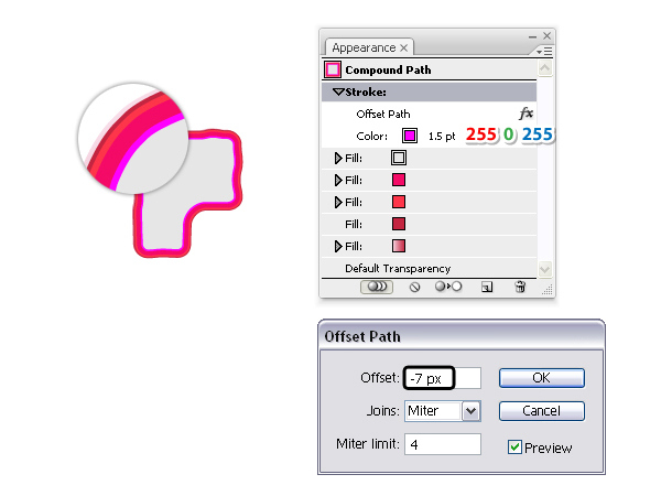
Step 16
Now, select the Stroke attribute in the Appearance panel and as the stroke color choose bright pink.
Set the Stroke weight to 1.5 pt then go to Effect > Path > Offset Path and apply a -7px Offset. This stroke should be right at the edge of the gray fill.
Step 17
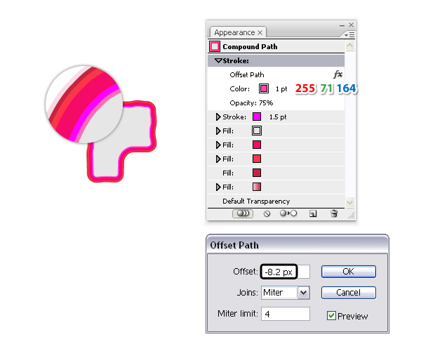
Still having the letter F selected, from the fly-out menu of the Appearance panel choose Add New Stroke this time. As a result you will get a second Stroke attribute at the top.
Replace the existing color with the one indicated then go to Effect > Path > Offset Path and apply a -8.2px Offset. Keep the Stroke weight at 1 pt but reduce the Opacity to 75%. This stroke should be right next to the first one as shown in the close-up. If yours is in the wrong place, you can make slight adjustments to the Offset value.
Step 18
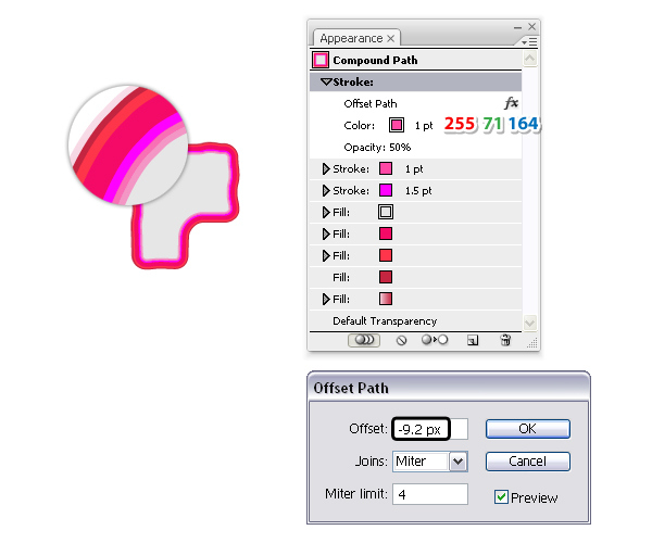
Add a third Stroke attribute above the other two and keep the same color from the previous stroke. Apply a -9.2px Offset and reduce the Opacity to 50%. This stroke should be right next to the previous one as in the close-up.
Step 19
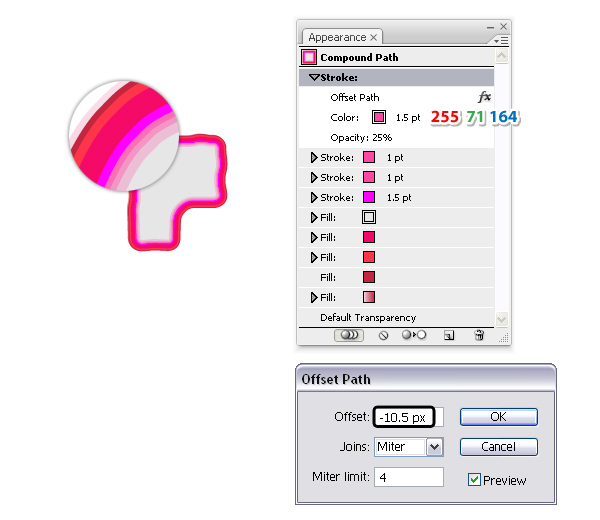
Add a new Strokee attribute above the others, keep the same color but increase the Stroke weight to 1.5 pt.
Next, apply a -10.5px Offset and reduce the Opacity to 25% this time.
The last three strokes create a smooth transition between the bright pink stroke and the gray fill.
Step 20
Having the letter F selected, from the fly-out menu of the Appearance panel choose Add New Fill. This new Fill attribute should be at the top of the Appearance panel. Select a white to black linear gradient at a -50 degrees Angle then set the Blending Mode to Soft Light. This will darken a little the lower right side of the letter “F”.
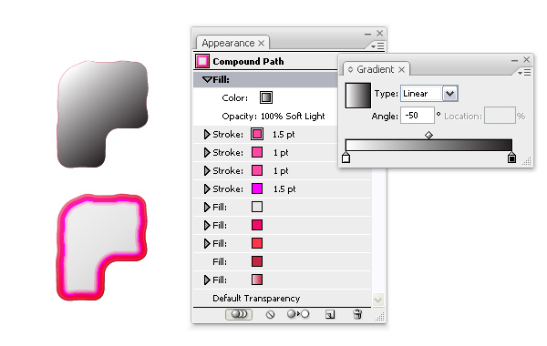
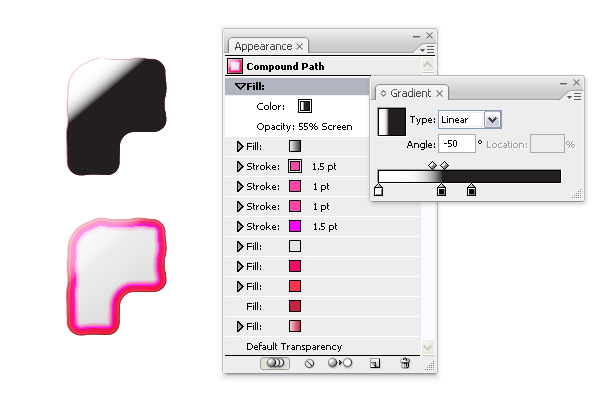
Step 21
Add a new Fill attribute at the top of the Appearance panel and select the linear gradient shown using white and two black stops at a -50 degree Angle. Set this fill to Blending Mode Screen (black becomes transparent) and 55% Opacity. As a result you will get a highlight on the upper left side of the letter “F”.
Step 22
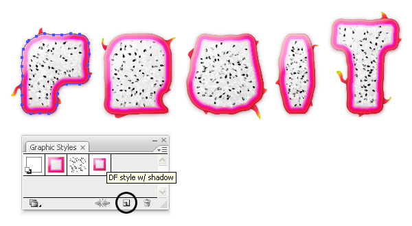
We are done with the Appearance panel for the moment but we will get back to it to add the shadows later. For now, you can save the dragon fruit style. While the letter “F” stays selected, press the New Graphic Style icon at the bottom of the panel (Window > Graphic Styles).
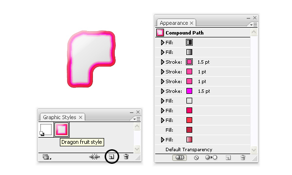
Step 23
At this point, your text should look like in the next image. Select the other four letters and apply the same appearances to them by selecting the dragon fruit style that you have saved in the Graphic Styles panel.
Step 24
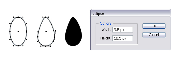
Let’s continue with the seeds of the dragon fruit. First, take the Ellipse Tool (L) and draw an ellipse having the dimensions shown.
Now, you need to distort it a little and you can do so with the Direct Selection Tool (A). Just move the handles of the top, left and right anchor points as shown in the image below. After you are done, select black as the fill color.
Step 25
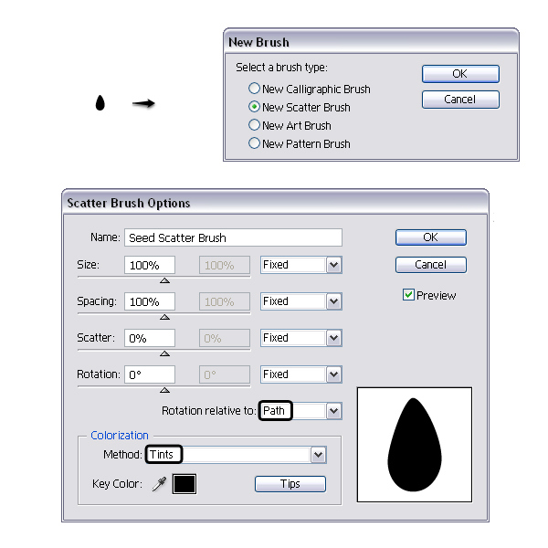
Drag the small seed into the Brushes panel and choose New Scatter Brush. In the Options window set the Rotation relative to Path and the Colorization Method to Tints. The last one is not mandatory but I usually select this for any brush. Leave the rest of the settings as they are but before you hit OK type a name for your brush.
Step 26
Next, grab the Pencil Tool (N) and draw a random swirl that covers the gray area of each letter.
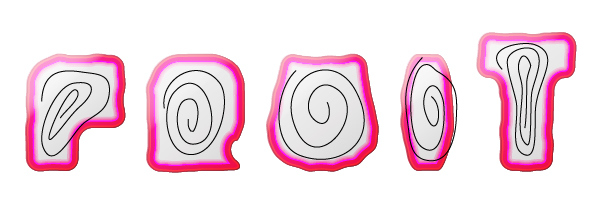
Step 27
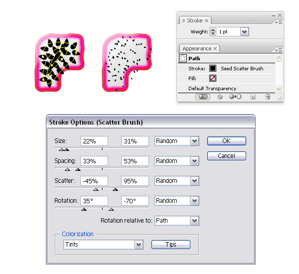
Focus on the letter “F” and stroke the path that you have drawn in the previous step with the Seed Scatter Brush.
Double click in the Appearance panel on the brush stroke to open the Stroke Options window and change the settings as shown below. There is no logic behind these settings, they were chosen randomly but basically all I wanted was to get tiny seeds that are scattered over the gray area as much as possible.
Step 28
Having the Stroke attribute selected in the Appearance panel, press the Duplicate selected item icon at the bottom and as a result you will get a second stroke under the first.
Open again the Stroke Options window then change the settings. This will generate more seeds.
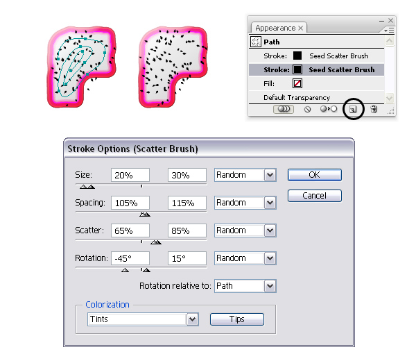
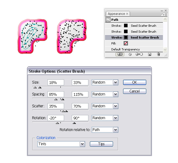
Step 29
Now, duplicate the previous stroke in order to get a third Stroke attribute.
Open again the Stroke Options window and change the settings as in the next image. At this point you should have enough seeds.
Step 30
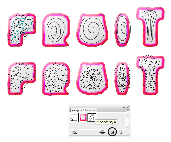
Now, let’s save the three appearances from the previous step into a dragon fruit seeds style. While the swirl over the letter “F” stays selected, press the New Graphic Style icon at the bottom of the Graphic Styles panel to save the style. After that, select the other four swirls and apply the same style to them by selecting it from the Graphic Styles panel.
Step 31
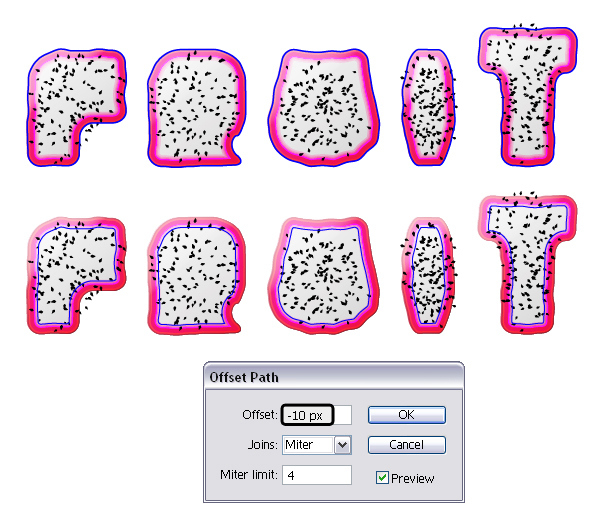
You have to mask some of the seeds but in order to do that you need the copies of the letters. Select the five letters then Copy and Paste in Front (Control-F).
Remove all existing appearances and just select a stroke then bring all of them in front of everything by going to Object > Arrange > Bring to Front (Shift-Control-]).
Now, select the copies of the letters (blue paths) then go to Object > Path > Offset Path and apply a -10px Offset. As a result you will get the smaller blue letters which are about the size of the gray area and before you continue, make a copy of each one for later use.
Step 32
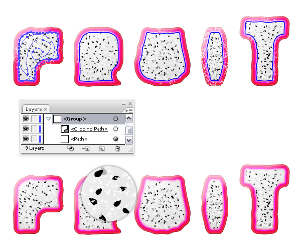
Focus on the letter “F”. Select the swirl along with the smaller blue letter (which should be in front) and go to Object > Clipping Mask > Make (Control-7). Now the seeds are inside the grayish area which is actually the pulp of the dragon fruit. Repeat the masking process for the other four letters.
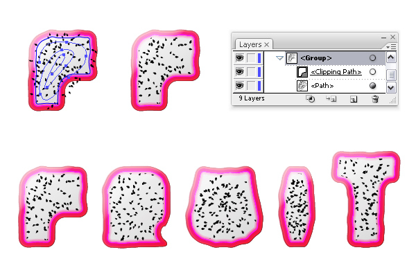
Step 33
Next, go to the Layers panel and select the swirl under the mask that you created earlier for the letter “F”.
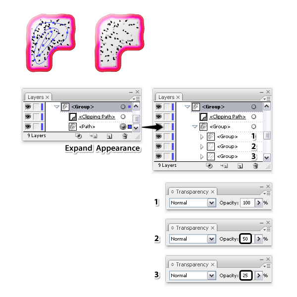
Select Expand Appearance from the Object menu and the stroked path will turn into a group containing other three groups (3 strokes = 3 groups of seeds).
Keep the first group at the top at 100% Opacity but set the second group to 50% Opacity and the third group to 25% Opacity.
Step 34
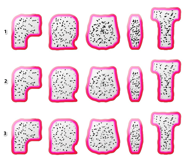
The letter “F” is ready but you need to repeat the previous step for the other letters as well (1). You can see the end result in the image below (2). At this point if you have a lot of seeds that are overlapping you can make a few adjustments by moving or removing some of them until you get the desired look. I’ve made a few adjustments but this is optional for you (3).
Step 35
Next, grab the Pencil Tool (N) again and draw a random swirl over each letter. Stroke these paths with a Scatter Brush called “Ink Spatter 1” that you can find in Brush Libraries Menu > Artistic > Artistic_Ink.
Set the Stroke weight to 0.1 pt. The Colorization Method is already set to Tints by default therefore select white as the stroke color to get a multitude of tiny white speckles over the grayish area. For visual purposes in the next image the stroke color is green instead of white.
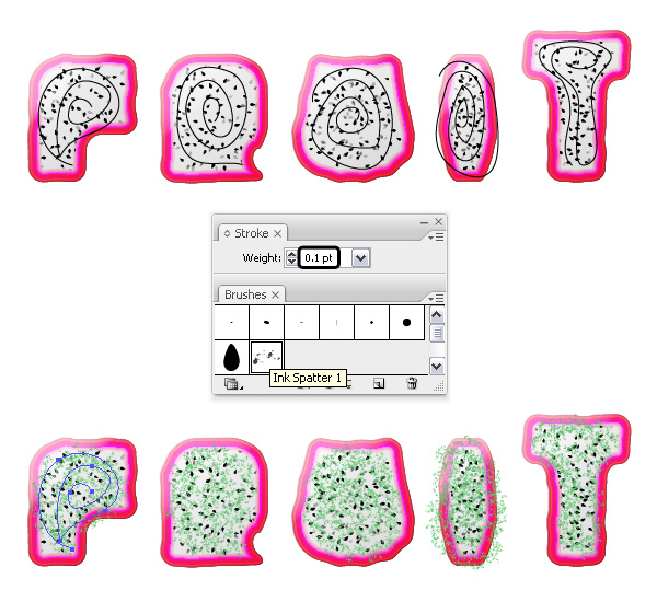
Step 36
Now, you need the copies of the smaller blue letters that I’ve said to make earlier. Bring all of them in front of everything by going to Object > Arrange > Bring to Front (Shift-Control-]).
Focus on the letter “F” and select the swirl along with the blue path then go to Object > Clipping Mask > Make (Control-7). Repeat the same thing for the rest of the letters to mask the white speckles. You can see in the close-up that you just added some texture on the pulp of the fruit.
Step 37
Next, use the Pen Tool (P) or the Pencil Tool (N) if you prefer and draw a few leaves of different shapes and sizes around each letter.
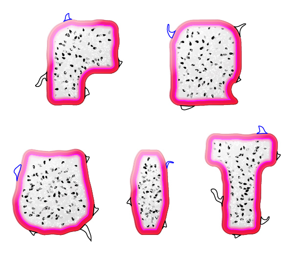
Step 38
Fill the leaves with the two gradients shown and adjust the angle according to the position of each leaf. The darker color of the gradient should be at the base of the leaf and the lighter colors at the tip.

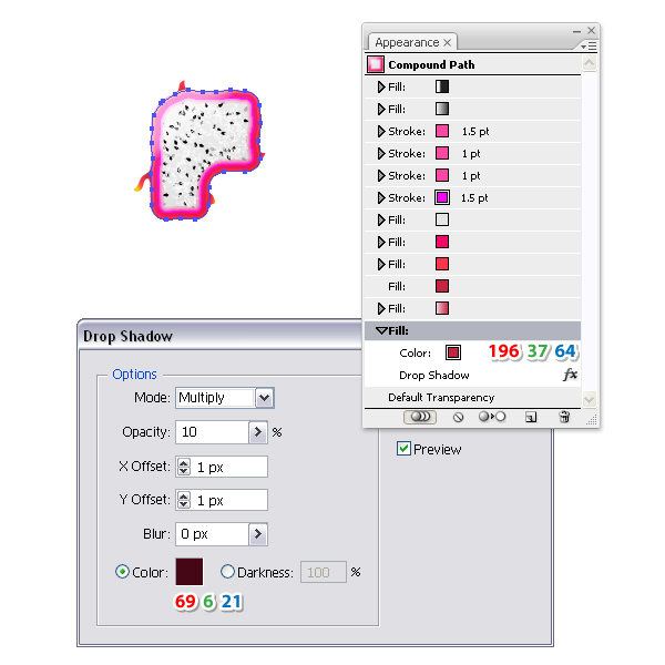
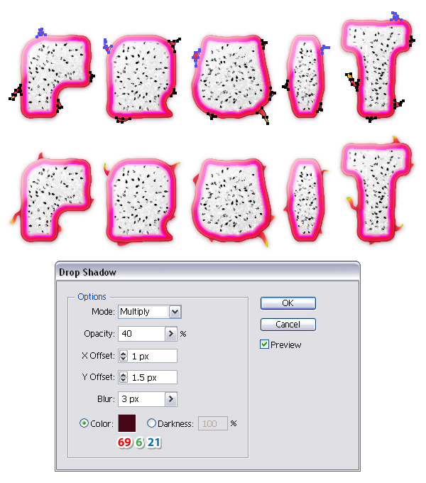
Step 39
It’s time to add the shadows. Select the letter “F” and take a look at all the appearances in the Appearance panel. Add a new Fill attribute at the bottom and use the color indicated as the fill color. Next, go to Effect > Stylize > Drop Shadow and apply the settings shown below.
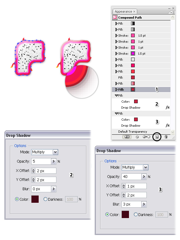
Step 40
Having the Fill attribute from the previous step selected in the Appearance panel (1), press the Duplicate selected item icon two times. As a result you will get two other Fill attributes (2 & 3). Open the Drop Shadow windows and change the settings as shown.
Step 41
While the letter “F” stays selected, press the New Graphic Style icon at the bottom of the Graphic Styles panel in order to save the new dragon fruit style with the shadows. After that, apply this new style to the other four letters.
Step 42
Now, select all the leaves then go to Effect > Stylize > Drop Shadow and apply the settings from the next image. At this point you are done with the dragon fruit text style.
Step 43
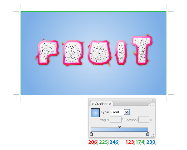
If you want to create the background as well here’s how. Grab the Rectangle Tool (M) and draw a rectangle having the size of the document that you’ve set at the first step. Move this rectangle to a new layer called “Background” behind the layer with the text effect. Use the radial gradient shown to fill this rectangle.
Step 44
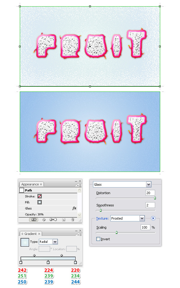
Copy and Paste in Front (Control-F) the rectangle and change the gradient fill.
Next, go to Effect > Distort > Glass, apply the settings shown and hit OK. As a result you will get the frosted look on the edges. Reduce the Opacity to 30% and you are finished.
Awesome! You’re done.
Here is the final image of the dragon fruit inspired text effect. I hope you enjoyed this tutorial and that you learned new things. Let me know if this text effect gets you excited for summer.
