One of the most used icons in the website design world is definitely a mail icon (envelope). For the skilled Pen Tool users the creation process can be very easy. They have a lot of experience with the Pen Tool and know how to move around and draw a flawless illustration in perspective.
Today we will show how to create a cute envelope icon in perspective for non-skilled Pen Tool users. Adobe Illustrator has few very useful tools and today we will try them out. One of them is the 3D effect Extrude & Bevel that will help us with Perspective. If you have a lower version of Adobe Illustrator don’t worry, you will be able to complete this tutorial.
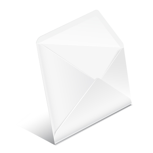
Final Image
Creating the Basic Shape of the Envelope
In this step we will be creating the basic shape of our envelope. You can be creative here and create the envelope you like. We will try to stick with the standard size and shape of the envelope.
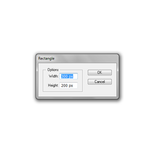
Grab the Rectangle Tool (M) from the Tool Panel and click somewhere on the Artboard. The Rectangle Options box will pop up. Set the dimensions to 300 x 200 pixels.
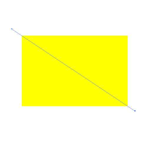
It will create a rectangle (Fill Color is not important).
Duplicate (Ctrl / Cmd + C, Ctrl / Cmd + F) the yellow rectangle. Now, grab the Line Tool (/) from the Tool Panel and create the line as shown on the picture below.
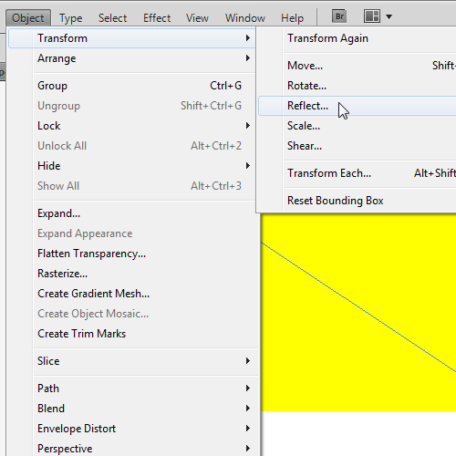
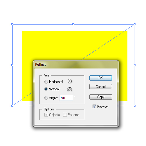
Under the Object select Transform > Reflect. Set the Axis to Vertical and hit the Copy button. It will create a mirror image for the line we have created in the previous step.
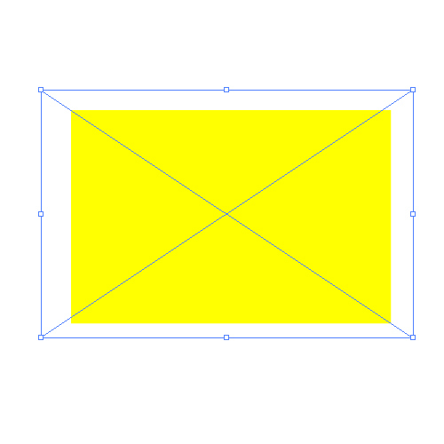
Select the copy of the yellow rectangle and the lines from the previous step and under the Pathfinder Panel hit Divide button. It will divide our rectangle into 4 parts.
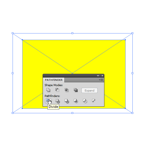
Ungroup (Shift + Ctrl / Cmd + G) the new shape and change colors of each part in order to be able to monitor the creation process.
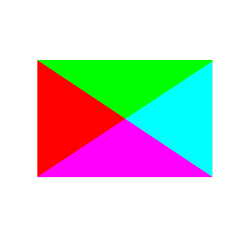
Select the green triangle, rotate it and place it as shown on the picture below.
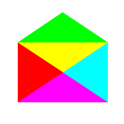
Let’s round some corners now. Make sure that the green shape is selected. Under Effect select Stylize > Round Corners. Set the Radius to 10 pixels and hit the Copy button.
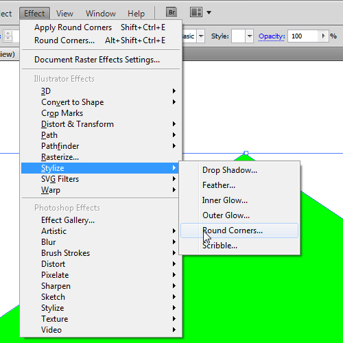
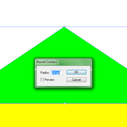
You will notice that only one corner is still sharp. We need actually two corners like that. Let’s fix that. First we will expand the green shape by selecting Object > Expand Appereance. It will turn the green shape into an editable object.
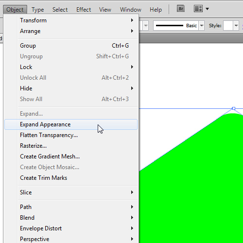
Now, grab the Line Tool (/) again and create a vertical line (in order to create a straight line hold the Shift key on your keyboard). Make sure to place the line in the middle of the envelope.
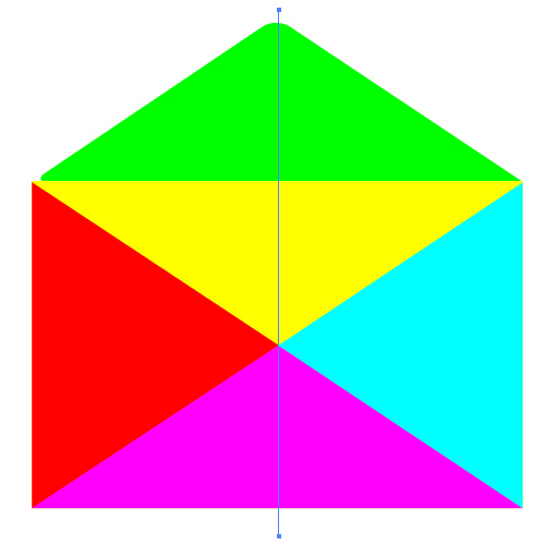
Select both, the envelope’s green cover and the vertical line and under the Pathfinder Panel hit Divide button.
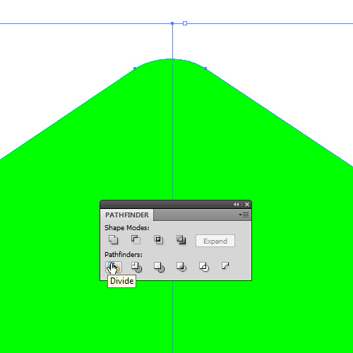
Ungoup (Shift + Ctrl / Cmd + G) the envelope’s cover and remove the left part. With the right part of the cover selected hit the Object > Transform > Reflect. Set the Axis to Vertical and hit the Copy button.
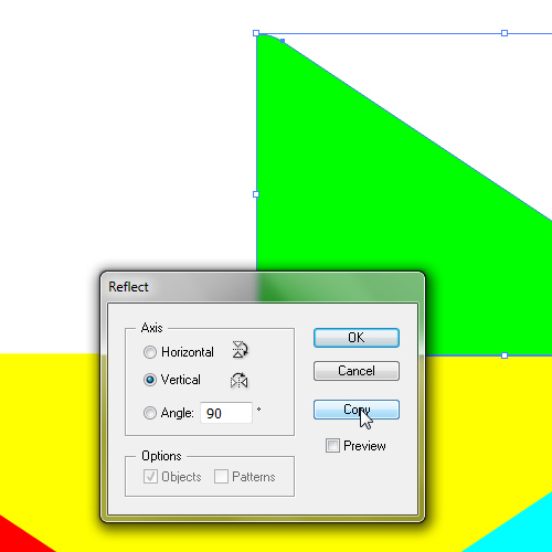
Move the copy of the green shape we have just created and place it as shown in the picture below.

Now we need to unite both shapes into one. Select them both and under the Pathfinder Panel hit the Unite button.
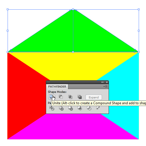
You should end up with something like this.
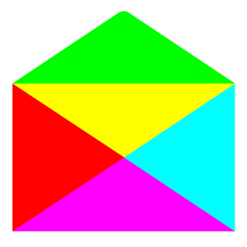
Using the same technique we will modify the purple shape as well. Grab the Direct Selection Tool (A) from the Tool Panel and select the anchor point on the top of the purple triangle. Nudge the anchor point upwards by a few pixels by using the arrow keys on the keyboard.
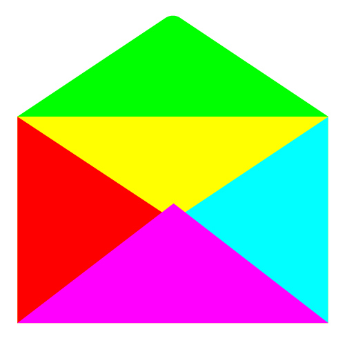
To create a round corner use the exact same technique we used to create the envelope cover. You should end up with something like this.
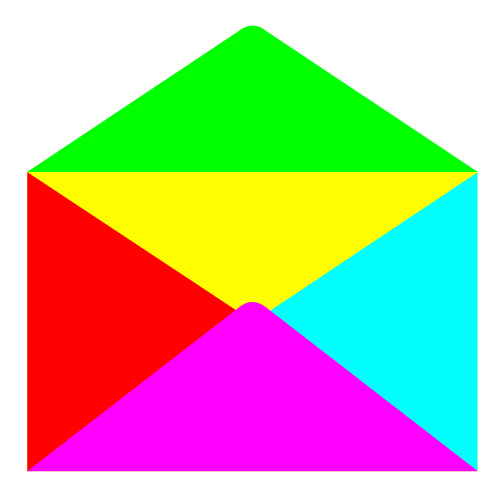
Grab the Add Anchor Point Tool (+) from the Tool Panel and add anchor points as shown in the picture below.
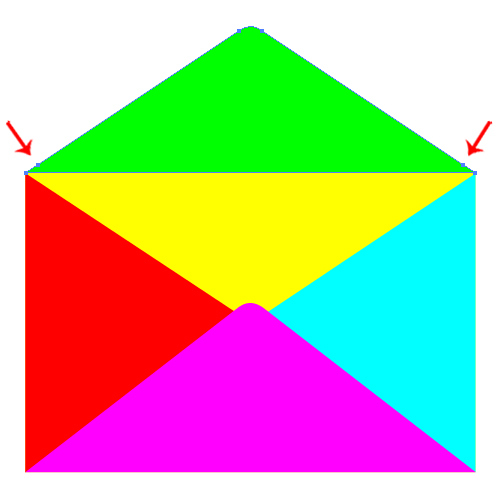
With the Direct Selection Tool (A) select each of the anchor point and nudge it for the few pixels upwards.
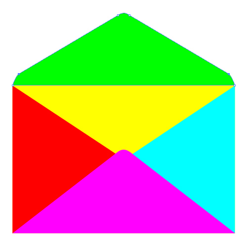
With the Direct Selection Tool (A) we will adjust the handles of the anchor points and make the new corners rounder.
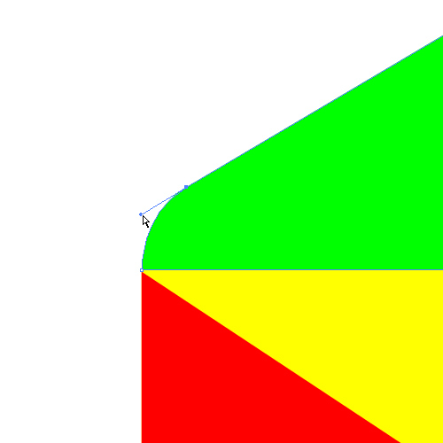
Make sure to do the same thing for the right anchor point as well.
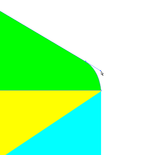
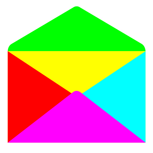
We will repeat this part of this tutorial for the lower part of the envelope and for the red and blue shape as well. You should end up with something like this.
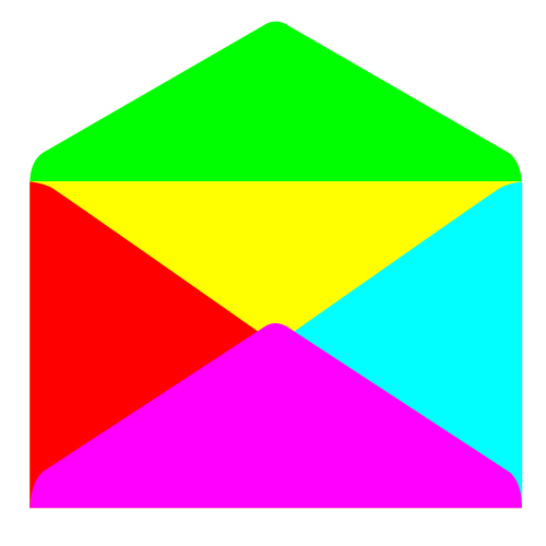
This is our basic shape of the envelope. All we have to do now is to turn this flat, colorful object into a nice 3D icon.
3D Effect
Before we apply a 3D effect to our envelope we have to make sure to group some parts. Select all elements except the envelope cover and Group (Ctrl / Cmd + G) them.
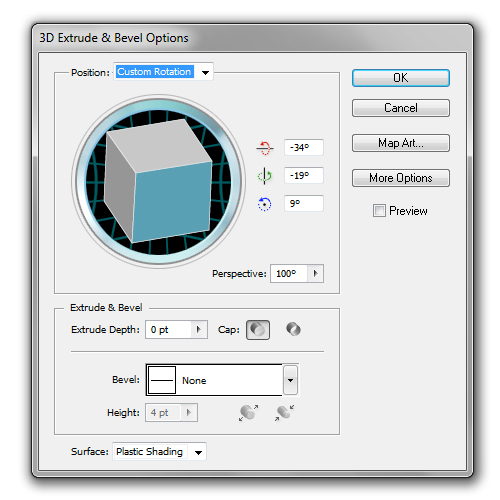
Select the group of elements and under the Effect hit 3D > Extrude & Bevel.
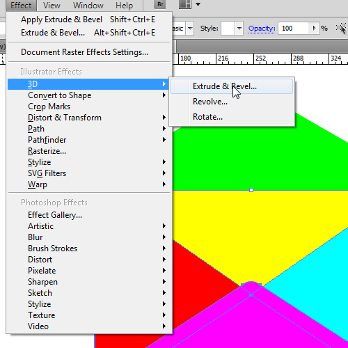
You can play around with the settings, just make sure to check the Preview box in order to see what are you doing. If you are not sure how to achieve a nice look you can use settings from this tutorial. As you can see, we have set the Extrude Depth to 0 and the Perspective to 120. It is very important to include perspective, otherwise you will end up with a distorted illustration.
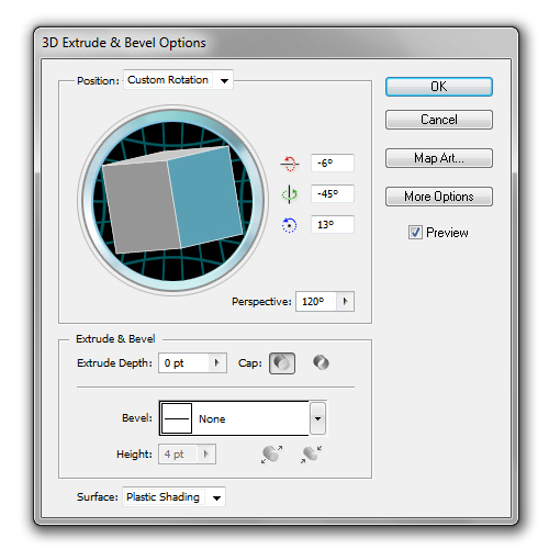
After applying the 3D effect your illustration should look like this.
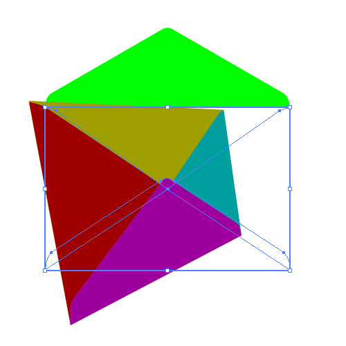
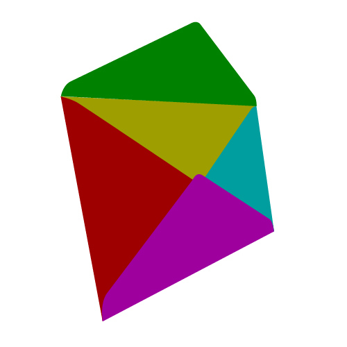
Now, select the envelope cover and apply the same effect. You wont be able to use same parameters we have used for the envelope “body”. Just play around a bit or use the settings from this tutorial. If your result doesn’t come out perfect, just do some adjusting with anchor points. Move them around until everything fits perfectly.
You should end up with something like this.
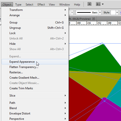
Select all elements and under the Object hit the Expand Appereance. It will turn our envelope into an editable object and we will be able to apply some nice colors.
To be able to apply some nice colors and color gradients we need to Ungroup (Shift + Ctrl / Cmd + G) the envelope. Don’t be surprised if you need to ungroup the envelope several times.
Appying Color Gradients
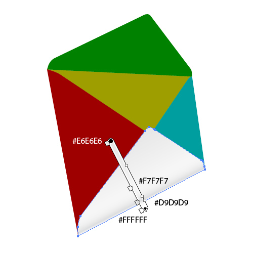
Our envelope is finally ready to get some nice colors. We will use solid colors and some color gradients. Try to stick with white color and different shades of gray/blue. Let’s get stared.
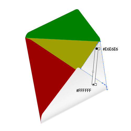
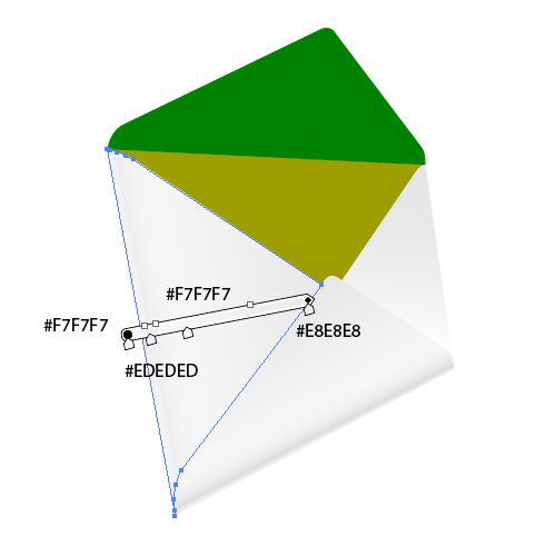
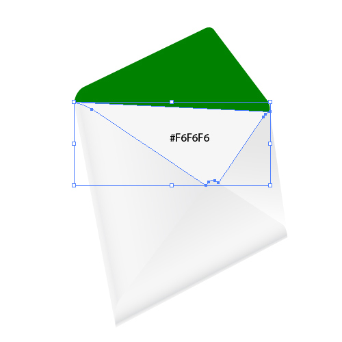
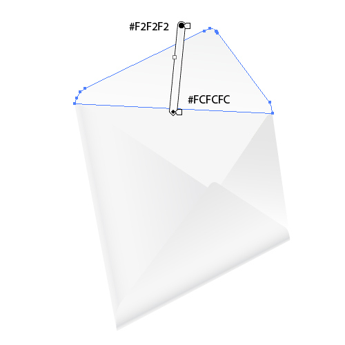
Devil is in the Details
As you can see, color gradients didn’t improve our envelope much. We have to do much more then coloring if we want to create an eye catching illustration.
In this part of the tutorial we will emphasize the edges. Creation process is quite simple, all we have to do is to duplicate (Ctrl / Cmd + C, Ctrl / Cmd + F) different parts of the envelope and to remove some anchor points.
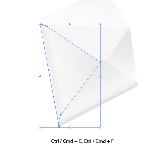
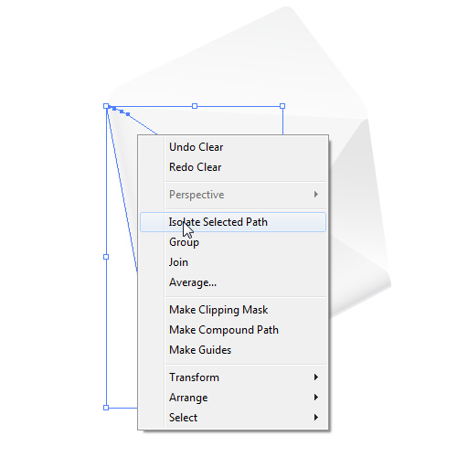
Under the Right Click select Isolate Selected Path. This way we’ll be able to modify only that part of the envelope without messing up the rest of the illustration. Grab the Direct Selection Tool (A) from the Tool Panel, select all anchor points beside those that form the left side of the shape and remove them (hit Delete on the keyboard).
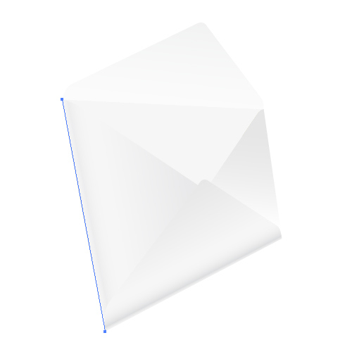
You will end up with the straight path perfectly lined up with the left side of the envelope.
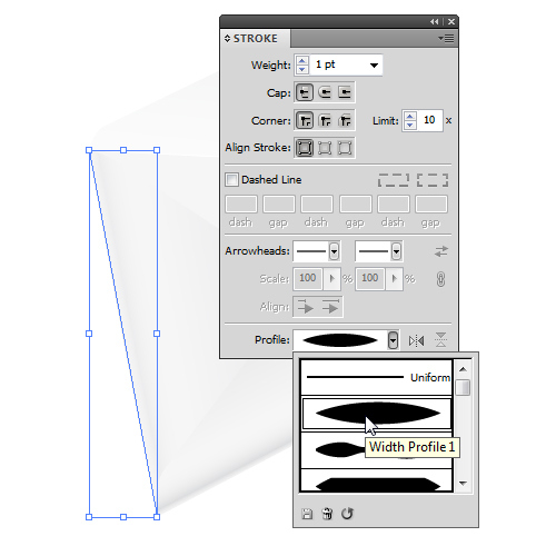
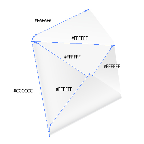
Make sure to remove the Fill Color and to set the Stroke Color to #CCCCCC. Also, under Stroke Panel make sure to set the Profile to Width Profile 1.
Repeat this step for other edges as well. On the picture below you can see which edges we are going to emphasize and what colors we will be using.
Creating Shadows
As all of you may know, shadows are one of the cruical effects for every illutration. Shadows trick our brain to see 2D objects as 3D objects. Shadows creat the depth and make illustration more alive. We will create few shadows by using the Blend Tool. The Blend Tool is a powerful tool that can be used for many different purposes. In our tutorial the Blend Tool will help us to create nice, soft shadows.
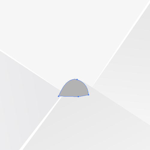
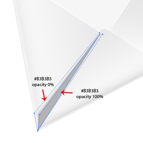
First of all, grab the Pen Tool (P) from the Tool Panel and create the shape as shown on the picture below. Set its Fill Color to #B3B3B3.
Next thing we want to do is to lower the Opacity. Under Transparency Panel make sure to set the Opacity to 0%.
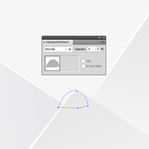
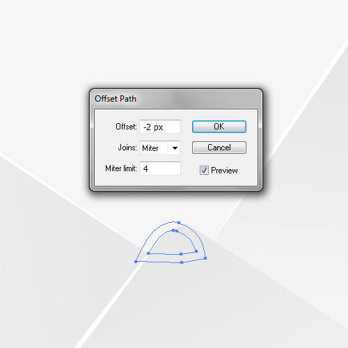
Under the Object select Path > Offset. Set the Offset to -2 and hit OK. Set the Opacity of the smaller shape to 100% and the Fill Color to #CCCCCC. You can also nudge the new shape a bit downwards.
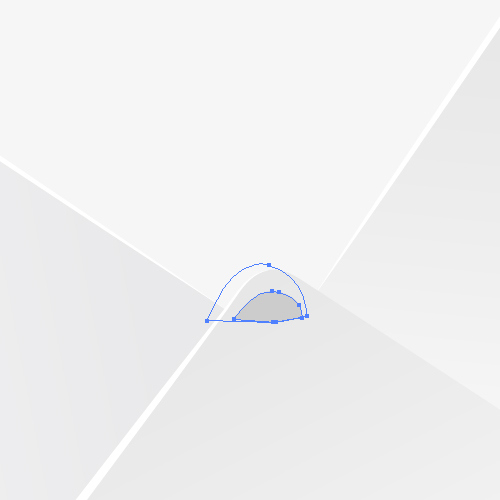
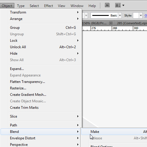
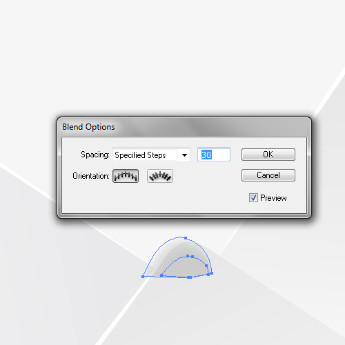
With both shapes selected go to Object > Blend > Make. And after that, select Object > Blend > Blend Options. Set the Spacing to Specified Steps and the value to 30. It will create a nice, soft shadow. Make sure to place it behind the lower part of the envelope.

We will create few more shadows like this. As you can see, the technique is very simple. Below we show how other shadows look.
Place the shadow behind the lower part of the envelope (don’t forget to put the edge highlight on the top as well).
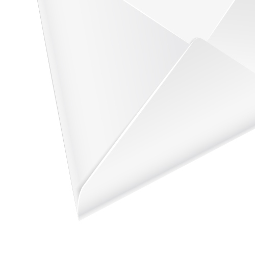
And, two more shadows…
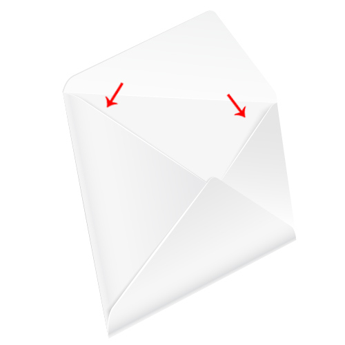
We are almost done. There is one thing that’s missing. We need to create a glue area.
Duplicate (Ctrl / Cmd + C, Ctrl / Cmd + F) the envelope cover. Now, grab the Line Tool (/) from the Tool Panel and create the lines as shown in the picture below.
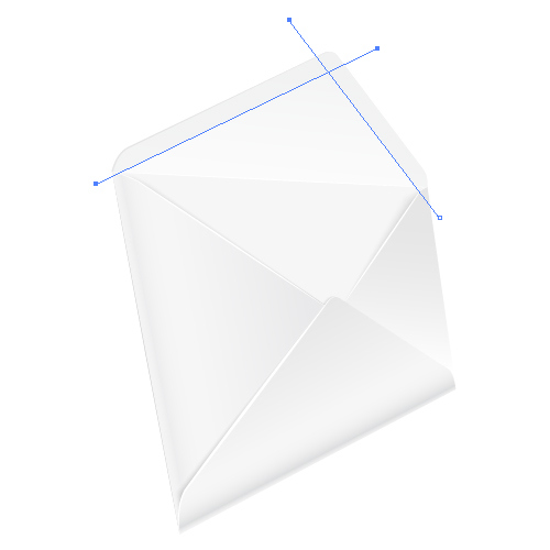
Select the copy of the envelope cover and two lines and under the Pathfinder Panel hit Divide button.
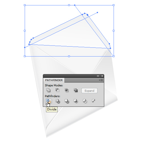
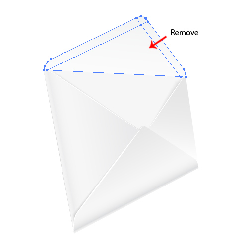
Ungroup (Shift + Ctrl / Cmd + G) the shape of the cover we have just created and remove the largest part. Select all the other parts and under the Pathfinder Panel hit the Unite button.
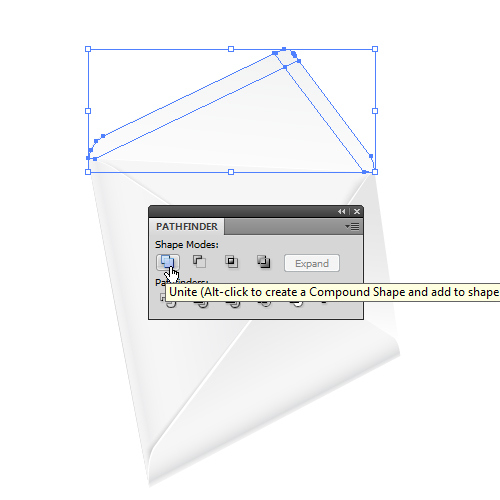
Set the Fill Color of the new area to #F2F2F2.
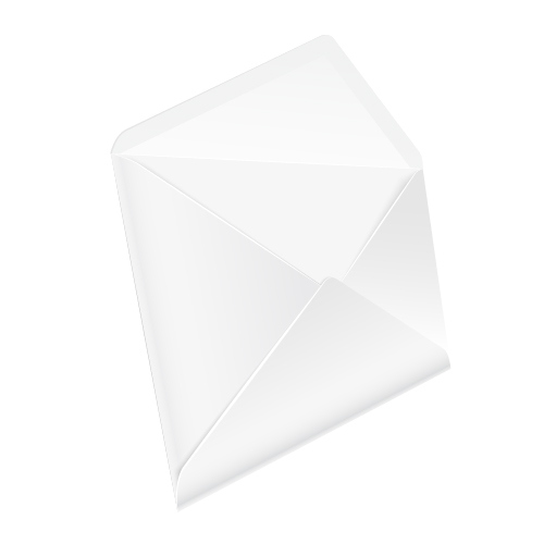
We need to create another soft shadow. Grab the Pen Tool (P) from the Tool Panel and draw the shape as shown in the picture below. Set the Fill Color to white (#FFFFFF).
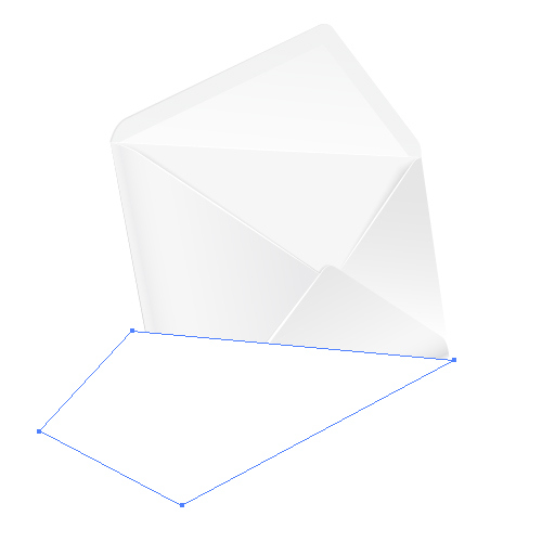
Now draw another shape. Apply the linear gradient as shown in the picture below.
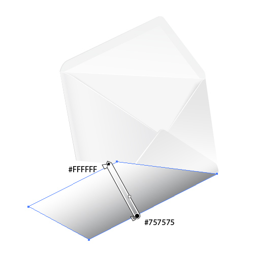
Select both shapes and under Object select Blend > Make. Select again Object > Blend > Blend Options. Set the Spacing to Specified Steps and the value to 30.
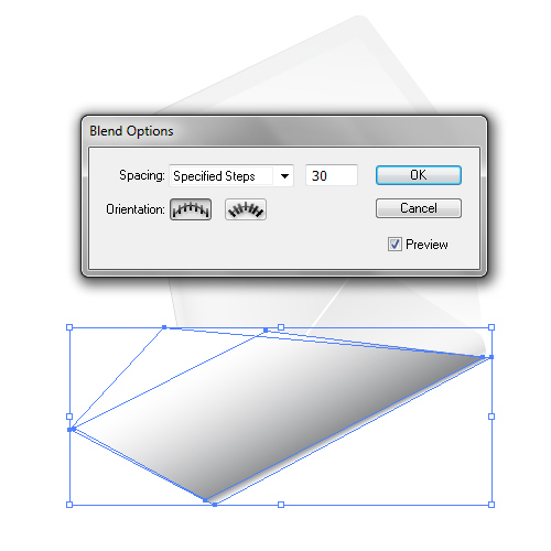
Make sure to place the shadow behind the envelope…
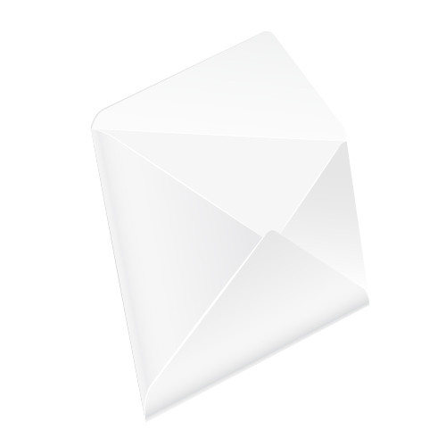
Final Image
…and voila! We are done!

Conclusion
Combining a few simple techniques allowed us to create quite a cute envelope illustration. So, even though you are not mastering drawing in perspective freehand there is a way to create illustrations like this, with a little help from Adobe Illustrator. I encourage you to practice more, to play around and add some details. I am sure you can do even better.